この記事は何
pythonの可視化ライブラリの一つであるseabornを使ってpandas.DataFrameのデータを分析するときに使いがちな関数を調べながらメモ。
この記事で使用するデータ
Boston house prices datasetというものを使用します。また、Python 3.8.5 で実行しています。
参考:sklearn.datasets.load_boston — scikit-learn 0.24.1 documentation
# sklearn以外は後ほど使用するので先にインポートし
import matplotlib.pyplot as plt
import numpy as np
import pandas as pd
import seaborn as sns
from sklearn import datasets

# Boston house prices datasetをダウンロード
boston = datasets.load_boston()
X = pd.DataFrame(boston['data'])
y = pd.DataFrame(boston['target'])
X.columns = [ f"feature_{i}" for i, _ in enumerate(X.columns) ]
以下の例では上記のコードの直後にコピーすれば実行できます。ロードしたデータは以下のようなデータ。

matplotlib
縦軸をlogスケールにする
matplotlib.pyplot.yscale — Matplotlib 3.3.4 documentation
ヒストグラムなどの縦軸をログスケールにすることが良くある。その場合、以下のようにしてlogスケールを指定する。
plt.yscale('log', nonposy='clip')
legendの位置を指定する
上の記事が古いため、要ドキュメント参照です。
pandas
pandas.DataFrameの指定列に対して前処理を行う
以下を参照。
query / 条件に合った行を選択
pandas.DataFrame.query — pandas 1.2.2 documentation
条件に合致したデータを絞り込みます。bostonデータで条件にあった行に対応するyのヒストグラムを表示してみます。
# 条件condに合致する・合致しない行のターゲットを比較する
cond = "feature_7 > 1.2 and feature_5 < 8"
cond_t = X.query(cond)
cond_f = X.query(f"not ({cond})")

plt.hist(y.loc[cond_t.index], label=f"{cond}")
plt.hist(y.loc[cond_f.index], label=f"not ({cond})")
plt.yscale('log', nonposy='clip')
plt.legend(loc='upper right',
           bbox_to_anchor=(0.98, 0.98),
           borderaxespad=0.,)

select_dtypes / 特定の型の列を選択
pandas.DataFrame.select_dtypes — pandas 1.2.2 documentation
データフレームで特定の型が含まれる列のみ選択する。df.select_dtypes(include=['float64', 'int64'])や df.select_dtypes(include='category') などと指定できる。numpyの型を指定する場合は「Scalars — NumPy v1.20 Manual」を参照。
drop / 指定した行・列を削除
pandas.DataFrame.drop — pandas 1.2.2 documentation
Xから教師ラベルが含まれる列を削除する場合など。df.drop(columns=['target'])や df.drop(['target'], axis=1) として target 列を削除できる。index方向を指定する場合はaxis=0(デフォルト値)とする。
seaborn
カテゴリ変数でデータを分けて、その間の分布の比較を行う
seaborn.displot — seaborn 0.11.1 documentation
X["target"] = y  # "target"列にyをコピーする
X["feature_5__is__less_than_7.4"] = X.feature_5 < 7.4
sns.displot(data=X, x="target", hue="feature_3", col="feature_7__is__greater_than_1.17", kind="kde")

カテゴリ変数ごとに2変数間の相関を比較する
カテゴリごとにyと特定の変数間の関係性を比較する。ここでは feature_12 が5.9を超えるか否かでプロットを変えてみる。
X["feature_12__is__less_than_5.9"] = X.feature_12 < 5.9
sns.lmplot(x="feature_12", y="target", hue="feature_12__is__less_than_5.9", data=X)

グラフを重ねないで並べる場合はcolを指定する。col_wrapで列数を指定する。
以下の例では feature_8 の値が1〜8の場合に targetとfeature_12の二変数のグラフをプロットする。
sns.lmplot(x="feature_12", y="target", data=X, hue="feature_8", col="feature_8", col_wrap=4)

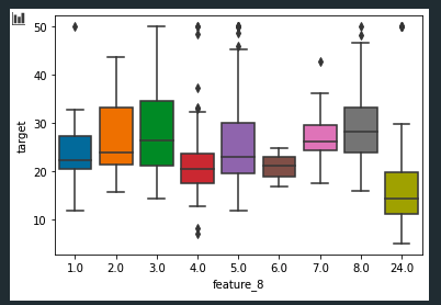
カテゴリ変数ごとに箱ひげ図を比較する
seaborn.boxplot — seaborn 0.11.1 documentation
カテゴリ変数ごとに箱ひげ図をプロットする。曜日ごとの売り上げの分布などのプロットなどで使うことがある。seabornの場合は1行でプロット可能。
sns.boxplot(x="feature_8", y="target", data=X)
これも lmplotと同様に hueにてさらにカテゴリ変数間の比較を指定できる。
X.feature_5 < 7.4かどうかで分布がどのように変わるかをプロットしてみる。
こうしてみるとfeature_8の値にかかわらず 「X.feature_5 < 7.4」がFalseだとtargetの値が高くなることが見てわかる。
plt.figure(figsize=(15, 3))
X["feature_5__is__less_than_7.4"] = X.feature_5 < 7.4
sns.boxplot(x="feature_8", y="target", hue="feature_5__is__less_than_7.4", data=X, palette="Set1")

カテゴリ変数ごとの平均・最大・最小などを棒グラフで比較する
seaborn.barplot — seaborn 0.11.1 documentation
estimator: callable that maps vector -> scalar, optional
Statistical function to estimate within each categorical bin.
estimatorにvector -> scalarの変換を行うような関数を渡すことで、それについての比較を行うことができる。lambda式か定義済みの関数をパラメータとして渡す。
エラーバー(棒グラフで比較する値の信頼度)の描画方法はciパラメータで指定する。
cifloat or “sd” or None, optional
Size of confidence intervals to draw around estimated values. ..(省略).. If None, no bootstrapping will be performed, and error bars will not be drawn.
基本的にはNoneは指定しない。
# カテゴリ変数ごとのfeature_8の中央値
from numpy import median
sns.barplot(x="feature_8", y="feature_2", data=X, estimator=median)

カラーパレットを設定・グラフに使用する色を変更する
seaborn.set_palette — seaborn 0.11.1 documentation
set_palleteより指定できる、その他のオプションについてはドキュメント参照。
MPL_QUAL_PALS = {
    "tab10": 10, "tab20": 20, "tab20b": 20, "tab20c": 20,
    "Set1": 9, "Set2": 8, "Set3": 12,
    "Accent": 8, "Paired": 12,
    "Pastel1": 9, "Pastel2": 8, "Dark2": 8,
}

plt.figure(figsize=(15, 10))

for i, pname in enumerate(MPL_QUAL_PALS.keys()):
    # カラーパレットを設定
    plt.subplot(3, 4, i+1)
    sns.set_palette(pname)

    # グラフを描画
    plt.title(f"palette = {pname}")
    sns.barplot(x="feature_8", y="feature_2", data=X, ci=None)

plt.tight_layout()
plt.show()
